Some of the earliest stuff in the exhibition was by Whistler - 1865-67: 'Symphony in white, no III' - Mike Beggs
-----------
Thanks for the link. I had forgotten Whistler. Frank Stella wrote a book called Working Space, more or less to justify his ungainly scuplture. It's worth tracking down in the library. The subject is what happpend to ideas of space in the Baroque. He missed the most interesting part of that transition which was the development of applied calculus of curves in architecture.
I first saw Stella's works about the same time as Warhol. He was shown in a placed called Dawn Gallery which was very mimimalist in its space. While I liked them, I also laughed at the ones painted with copper paint. I recognized that kind of paint from old cans I had opened and played with as a kid. When I looked at the paintings closely I could see he didn't mask the edges. So that's pretty hard to paint that closely together. Here's a picture I just found:
http://upload.wikimedia.org/wikipedia/en/6/6f/Frank_Stella,_1964,_photo_by_Ugo_Mulas.jpg
My favorite pin stripe painting was slightly later, called Double Vee. His shaped paintings work well both with and against the shape.
For the more recent stuff, I asked some painter friend where did Stella get the aluminum honeycomb. He told me it came from the aircraft industry. It's used to stiffen empty spaces in the airframe. It looked really expensive and really hard to work with. The best piece in that show was an apparently solid wood relief mounted on a diagonal.
``Like this quote from Frank Stella: `I have no difficulty appreciating (and up to a point, understanding) the great abstract painting of modernism's past, the painting of Kandinsky, Malevich and Mondrian, but I do have trouble with their dicta, their pleadings, their impassioned defense of abstraction. My feeling is that these readings, these theoretical underpinnings of Theosophy and antimaterialism, have done abstract painting a disservice which has contributed to its present-day plight.' ''
A long time ago, I tried to read a book Kandinsky wrote on color theory. I couldn't get through it or understand what he was talking about. It was color mysticism.
The central art-working issue about all the elements of line, shape, color, space is the combination is used to produce a sense of presence--in analogy, give the work `a life of its own'. This is the bare bones perception-concept we are dealing with. When minimalism works, it has whatever-it-is pared down to something like Japanese or Chinese painting. The best traditional works I've seen that deal with this directly are in some of the Chinese scroll paintings. They have an appropriate traditional theme, the poet in the wilderness. The poet is usually a tiny figure sitting a dock or poling a small dugout in the close foreground in a mountain lake below vast and tiered cliffs. Some of these works are really big, like eight or nine feet tall.
Then there are the architectural monuments, especially cathedrals and big renaissance churches and buildings were a similar feeling of presence in the created space is used to give holiness or power look and feel.
In my theory of everything, it is this sense of presence about an object or even something like a tree, animal, or landscape, that gets magic names and god named qualities. The 19thC called this experience the sublime. The romantic painting of the early 19thC almost universally created great landscapes with scary looking mountains and scary forces of nature at work. Looking it up on wiki,
``The development of the concept of the sublime as an aesthetic quality in nature distinct from beauty was first brought into prominence in the 18th century in the writings of Anthony Ashley Cooper...''
It goes on to say Cooper made a trip through the Alps. That's sounds about right from my days hiking and climbing in Yosemite and the Sierra. If you are out there by yourself you can get creeped out. I read on to the description of Kant's definition, but I think he has it all mixed up. The other description from Schopenhauer, Hegel, Victor Hugh, and the moderns are pretty good reading, even if I think they are wrong.
So I think we try to domestic a little bit of that kind of experience in art---some art.
Getting back to Stella. The best of his early work had a lot of this presence. The later painted messes were too distracting. Maybe he thought sheer ugly would do the trick. What's funny is that the art I think they are based on or suggested by is graffiti.
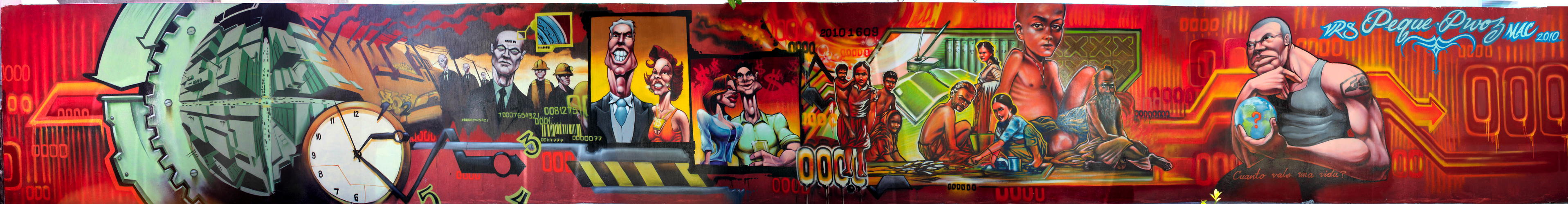
What makes me laugh is that some graffiti is much better than Stella. Take a look at this from Guadalajara muralist tradition:
http://www.graffiti.org/peque/peque_pwoz1.jpg
Click on the image to blow-up. Peque and Pwoz really studied the Mexican muralist and a lot of the old 30s commie propaganda work. I like this painting a lot. Check out the bar code man, with chain and sprocket as thought-speak. The bougeois as smily face idiots, the self-satisfied beer swilling middle class, then the real people of the earth.
My only criticism, is these guys have to work on their feet. Feet are always a pain in the ass to do. You just have to practice them over and over. Take your shoe off, put your foot on a table and draw the fucker.
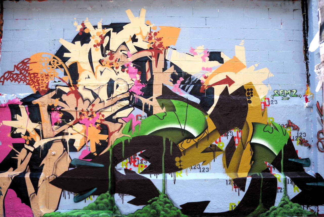
Okay so that wasn't abstract. Here is something more like Stella:
http://www.graffiti.org/vs/col_demer_6.jpg
I think of this kind of work as speech-chaos, and Stella as space chaos. Everything looks like it is supposed to mean something or make sense, but it doesn't.
Here's the home page:
I get in the mood to look at this work every now and then. Berkeley went through a period back in the 90s when there was a real phase change and the graffiti got good. The problem was it was apolitical or just vaguely suggestive of social protest of some sort. Of course except for the police done as piggies. I found a nice book on this period. Later I re-discovered the work on the web. The best political work is almost entirely non-US sources.
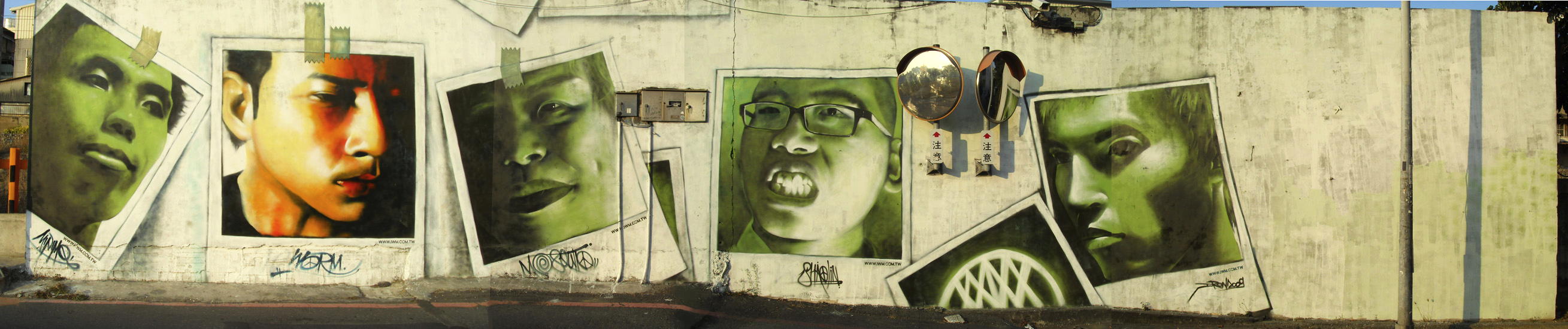
Here is a cool work from Taiwan. Each guy does a self portrait as bad polaroid or bad color lazer print taped to the wall. Chuck Close?:
http://www.graffiti.org/taiwan/10_iwm10.jpg
CG